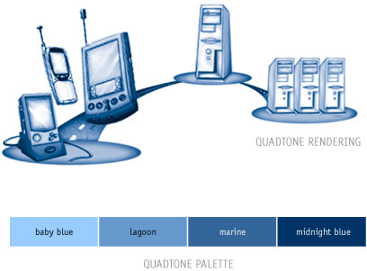
Quadtone rendering should be used for secondary illustrations, but can also be used for images that would be too overpowering if rendered in full color. Obviously, this determination is in the hands of the designer, but should be consistent with AvantGo's design philosophy and style hierarchy. The best way to achieve best effect with a quadtone image is to render the image in a monochromatic color before converting the image to quadtone. This will help the artist keep the contrast of the image from becoming too heavy or too light. The same rule applies for rendering a full color illustration for quadtone rendering (e.g., do not use outlines). We have supplied a quadtone palette so that the quadtone colors can be duplicated exactly. There are also different quadtone palettes (RBG, CYMK, and Pantone) depending on your presentation format. |
||
