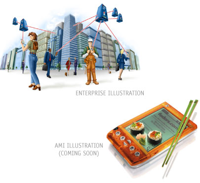
Full-Color rendering should be used when an illustration is the main focal point of a page. Rendering should be done in a realistic fashion, including lighting and shadow. Color, contrast, and lighting can be used to emphasize a focal point within an image. When using color to emphasize an object, use AvantGo's accent colors from the respective palettes. Emphasis should be used in moderation to follow AvantGo's minimalist philosophy. Outlines should not be used in rendering images. This would conflict with the semi-realistic nature of the style.
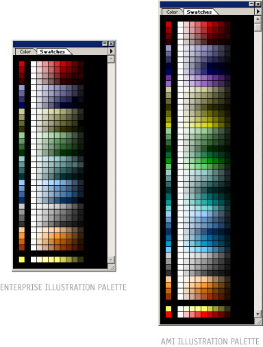
When creating an illustration for AMI, the artist must use the AMI illustration palette. This palette has a wider range of vibrant colors, which should still be used sparingly in order to maintain the AvantGo look and feel and adhere to the AvantGo minimalist design philosophy. Artists creating Enterprise illustrations must use the smaller and slightly more conservative Enterprise illustration palette.
Each color in the palettes has a gradation from tint to shade. This can be used to render any object in a realistic fashion. Various PhotoShop color swatches have been created for the convenience of designers and artists. Use the appropriate RGB color swatches to illustrate for Web or PowerPoint presentations. If print output is the goal of the project, use the CYMK palette.
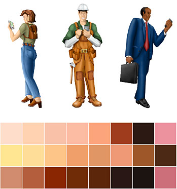
As stated previously, the skin tone palette was built to give creative developers the necessary tools to create realistic visual depictions of human beings. It is intended for use in illustrations only, and the skin tone palette may not be used for any other application than rendering skin tones. Note that the colors in this palette are not Web-safe. This means that they will dither well on most newer monitors, but on some displays they may not look as they did to the original artist.
Use of this palette within the above framework is left to the individual artist's discretion.
|
||


