|
||||||||||||||||||||||||||||||||||||||||||||||||||||||||||||||||||||||||||||||||||||||||||||
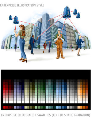
The Enterprise Palette is comprised of 13 colors from the Base Design Palette plus 20 additional Enterprise colors. The Enterprise Palette is designed to appear more subdued. The colors on the Enterprise Palette are used mostly for Enterprise illustrations and in some major graphic elements that serve as the main point of attention on the page. For illustrations, any tint or shade of the color on the palette can be used to render highlights and shadows. For graphic elements, use only the exact color value from the palette. Gradation is only allowed between two analogous colors.
The AvantGo Illustration Style should always remain the same. What differentiate Enterprise from AMI Illustrations are their respective color palettes. The Enterprise Palette has fewer colors to chose from. Warmer colors should not dominate the illustration; they should be used as accent rather than base colors. The color swatches shown on the left are used for all Enterprise Illustrations. The bottom color strip shows the Enterprise Palette. Illustrators may add black or white to any of the Enterprise colors to create a larger, more versatile palette. Shades or tints should only be used for illustration purposes. |
||||||||||||||||||||||||||||||||||||||||||||||||||||||||||||||||||||||||||||||||||||||||||||
