![]()
![]()
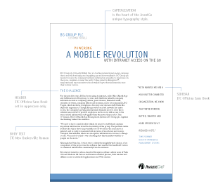
I tightened the corporate typography by limiting the number of fonts from each font family (ITC Officina Sans and ITC New Baskerville) and creating a guideline of how to use each font. The style guide included usage for each of the fonts and the typo-graphy style for application types including online, print and presentations, covering font selections for different levels of headers, side bar, captions, footnote, etc., as well as color and capitalization styles.
Two new fonts (Verdana and Geneva) were added to the standard font set. I chose these for their suitability in online and presentation settings, the most common communication methods for the field.
 |
||
|